Wednesday, 28 February 2024

TagBrush

 Making a TagBrush in Photoshop

Creating a Tag brush involved blending various pictures to achieve a watermark, akin to a spray type effect. To craft the brush, I used images like the original logo, a scratch mark picture and a blur effect picture to add depth. I lighten the entire composition at each step while embedding each picture to give a good visual effect. Later, the final step was to transform the image into a brush. Now, as the brush is created, you can simply used to watermark or stamp your every creation with the logo. Also the more you click, the more darker the brush becomes. 

Photoshop

Learning Photoshop

I was confused between Illustrator and Photoshop, like both can be used for editing then why do we have two different software. But it's clear that Photoshop is majorly used for editing pictures. It has similar features like layering, transform tools and painting-brushing tools. With a creative thinking, it's very easy to edit your desired thing in photoshop. As it has array of powerful tools from the magic wand to layering. The video is a tutorial for beginners, showing all the tools and features while editing a photo. I don't think it's going to be that difficult to learn Photoshop, if you have already started with Illustrator.


This video explains the top 7 new features in Photoshop 2024, which are easy to use rather than using different apps to edit that. It explains feature like remove tool which is used to remove or delete unwanted objects from the pictures. The lens blur tool is a great feature, used to blur the background or the objects that you want to be blur. Then it also explains how you can unlock different filters in the app. It also shows that the contextual taskbar has some new features and behavior. The new version also generative AI which is easily available for commercial use. Further, it can be also used as generative expand. Lastly, the most interesting feature is that it can automatically create the content credentials.


The below video is a basic tutorial to edit a dropping effect on the picture. It uses two different picture which are the picture of the lady and the dropping effect. Later they are merged using layering and later the extra amount is removed using the brush tool to give an effect of dropping picture. Then it shows how to make and effective background, using different colors, gradient tools and layering. Later a shadow is added to the picture.


Monday, 26 February 2024

SelfPortrait-Poster

 Women in Tech

I thought creating a portrait would be a challenging and a tedious task. Initially, the task seemed difficult, but later I started enjoying and my work started getting faster. I opted for a geometric style approach to infuse creativity into the process. I chose the picture because I

Picture
have headphones on it, so it can be helpful further for my poster as my propaganda is 'Women in Tech'.

I chose to use the phrase 'code like a girl', as it challenges the stereotypes and promote inclusivity in the male-dominated tech industry. When someone is encouraged to 'code like a girl', it emphasizes embracing one's unique perspective and approach to coding, irrespective of gender. It also suggests that there's no specific way to code based on gender and encourages individuals, regardless of their gender, to bring their creativity, skills, and unique approaches to the table. It's about breaking down gender-related stereotypes in tech world and fostering an environment where everyone feels welcome and empowered in the world of technology.

Self-Portrait

Poster


Thursday, 22 February 2024

Logo

MAKING OF A LOGO

Creating the logo was an exhilarating and purposeful experience. I never knew that crafting a logo was a very thoughtful and strategic process; keep it simple and minimal is best. I sketched out ten rough drawings that represented different aspects of my identity. The concepts of my logo revolved around my initials, meaning of my name and things I deeply cherish like flowers, butterfly and music.

Initial 10 drawings
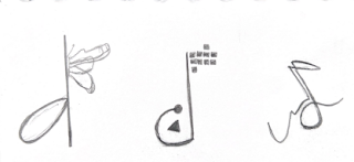
Shortlisted 3 drawings

The next step involved a meticulous shortlisting, where I carefully narrowed three promising logos.
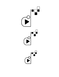
Shortlisted 3logos
Finally, upon careful consideration, I finally settled on one design that resonated with me the most. The journey continued with the transformation of the chosen design to a black and white version. I realized that the more its simple, the more its attractive. Later I made three different color variations of the logo; each color combination holding a specific meaning. They symbolized facets of technology and the dark colors added depth.


3color variations


In the end, what started as a fun exploration became a logo that not only reflected me but also my passions and interests. I learnt that making of a logo can be an enjoyable process and the satisfaction you get at the end can't be described.